Whenever I come across a website with a clean and consistent UI, my first instinct as a web developer is almost always the same:
F12. Inspect Element.
I start digging into colors, font sizes, border radiuses, spacing, shadows, and all the small details that make an interface feel consistent.
Sometimes I only want to figure out the color used by a single button. But before I know it, I am already scrolling through the entire page, trying to understand the visual language behind the design.
That is still manageable when dealing with one or two components.
The problem starts when the goal is to actually understand the design system of an entire website.
Which colors are really being used as primary tokens?
What does the typography scale look like?
Is spacing actually consistent across different pages?
Do buttons, cards, inputs, and badges follow the same visual rules?
And perhaps the most annoying part: after collecting all that information, the documentation still has to be created manually.
That led to a simple question:
Why not build a tool that can reverse engineer a website's design system automatically?
Not just extract colors, but analyze visual patterns, organize them into design tokens, detect common UI components, and turn everything into documentation that can actually be used.
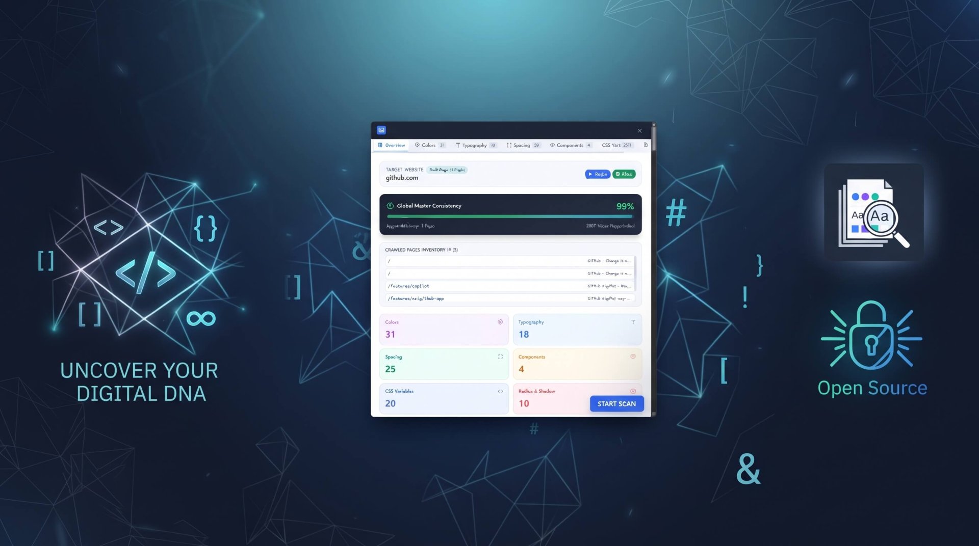
That weekend experiment eventually became Design System Reverse Engineer — a Chrome Extension built with Manifest V3, React 19, TypeScript, Vite, Tailwind CSS, and Shadow DOM.
In this article, I want to share how the extension was built, why some of the architectural decisions were necessary, and a few technical gotchas that made the development process more interesting than I initially expected.
The Problem
When researching or auditing the design system of a website, the workflow is usually pretty repetitive:
- Inspect a button to find its
background-color,border-radius,padding, andbox-shadow. - Inspect headings and paragraphs to identify font family, font size, weight, and line height.
- Collect colors used across surfaces, borders, icons, and text.
- Record everything in Notepad, a spreadsheet, or a separate document.
- Reorganize all of that information into design tokens.
Then the same process has to be repeated when moving to another page.
The funny thing is that most of the information we need is already available in the browser.
So the goal was simple: build a tool that could extract as much useful visual information as possible from a webpage and turn it into a structured design system document.
The extension focuses on five major areas:
- Color System — HEX/RGB values and potential visual roles such as Primary, Surface, Text, Border, and Accent.
- Typography — font family, weight, size, line height, and semantic groupings such as Display, Heading, Body, Caption, Label, and Navigation.
- Design Tokens — spacing, border radius, shadows, and commonly used dimensions.
- UI Components — heuristic detection of patterns such as Button, Card, Input, Badge, Navbar, Modal, and other common UI structures.
- Documentation — WYSIWYG editing, Markdown export, CSS variables, and implementation snippets.
The workflow changes from:
Inspect → Copy → Paste
to:
Scan → Analyze → Structure → Document
Extension Architecture
Building a Chrome Extension with React is slightly different from building a conventional web application.
The stack used for this experiment is:
- Chrome Extension Manifest V3
- React 19
- TypeScript
- Vite
- Tailwind CSS
- Shadow DOM
- Chrome Extension APIs
At a high level, the extension consists of several parts:
- Content Script — runs on the target page and performs the scanning process.
- React UI — handles the extension interface, including the off-canvas panel.
- Service Worker — handles background processes and communication between different parts of the extension.
- Analyzer — processes DOM and CSS information into design tokens and component metadata.
- Markdown Generator — converts the analysis into structured documentation.
- Export Layer — generates CSS variables and implementation snippets.
One of the first challenges was not actually the analyzer.
It was figuring out how to inject a React interface into someone else's website without allowing CSS from either side to interfere with each other.
1. Using Shadow DOM for CSS Isolation
This became one of the most important architectural decisions.
Imagine running the extension on a website with CSS such as:
button {
  all: unset;
}

* {
  box-sizing: border-box;
}
Or imagine the opposite scenario, where the extension uses Tailwind CSS and its styles accidentally affect the target website.
Injecting the extension directly into the page's normal DOM can create a lot of opportunities for CSS conflicts.
The solution was to use Shadow DOM.
The extension creates a dedicated host element:
const shadowHost = document.createElement('div');

shadowHost.id = 'chrome-ds-re-root';

shadowHost.style.position = 'fixed';
shadowHost.style.zIndex = '2147483647';
shadowHost.style.top = '0';
shadowHost.style.right = '0';

const shadowRoot = shadowHost.attachShadow({
  mode: 'open'
});
The extension stylesheet is then inserted directly into the Shadow Root:
const styleEl = document.createElement('style');

styleEl.textContent = stylesText;

shadowRoot.appendChild(styleEl);
React is then rendered inside that isolated environment:
const appContainer = document.createElement('div');

shadowRoot.appendChild(appContainer);

const reactRoot = createRoot(appContainer);

reactRoot.render(<App />);
This creates a clear styling boundary between the extension UI and the target website.
For an extension that needs to work across arbitrary websites, this kind of isolation is extremely useful.
2. The Vite Code Splitting Problem
This was probably one of the more frustrating issues during development.
The first build appeared to work perfectly.
Then Chrome started throwing strange runtime errors.
Some CSS-related output even looked corrupted:
7uto;
margin-t0;
At first, the problem looked like a Tailwind or stylesheet injection issue.
It turned out to be related to the way the build output was being generated.
Vite uses Rollup under the hood and can split application code into multiple chunks.
That is normally a good thing for web applications.
But a content script has a different deployment model. In this particular implementation, the content script needed to be distributed as a predictable standalone bundle rather than relying on dynamically resolved chunks.
So the Rollup configuration was adjusted:
export default defineConfig({
  plugins: [react()],

  build: {
    outDir: 'dist',
    cssCodeSplit: false,

    rollupOptions: {
      input: {
        content: resolve(
          import.meta.dirname,
          'src/content/content.ts'
        ),

        'service-worker': resolve(
          import.meta.dirname,
          'src/background/service-worker.ts'
        ),
      },

      output: {
        entryFileNames: '[name].js',
        manualChunks: undefined,
      },
    },
  },
});
The result was a standalone content.js bundle containing the dependencies required by the content script.
The final bundle was around 680 KB.
It is larger than a heavily optimized split bundle, but for this particular use case the trade-off was worthwhile.
The lesson was simple:
Bundling strategies that work well for web applications do not always map directly to browser extensions.
Predictability was more important here than squeezing every possible kilobyte out of the content script.
3. Multi-Page Crawling Mode
Once the single-page scanner was working, another problem became obvious.
One page is not necessarily enough to understand an entire design system.
A homepage might use one shade of blue while a pricing page uses another.
A card might have a 12px radius on one page and 8px on another.
Typography may also appear consistent until another part of the site is inspected.
If only one URL is analyzed, it is easy to mistake a local pattern for a global design decision.
That is why the extension includes Multi-Page Crawling Mode.
The basic workflow is:
- Find internal links within the same domain.
- Collect relevant URLs.
- Process those pages asynchronously.
- Store the analysis results for each page.
- Combine the results into a Master Design System Specification.
Once the results are aggregated, it becomes possible to analyze how frequently certain tokens and components appear across the website.
For example, a particular color might appear across almost every page.
A component such as a Navbar or Footer might also appear consistently throughout the site.
That information can then be used to generate a Global Consistency Score.
Color Consistency
██████████████████░░ 89%

Typography Consistency
████████████████░░░░ 81%

Spacing Consistency
██████████████░░░░░░ 72%

Component Consistency
█████████████████░░░ 85%
These scores are not intended to judge whether a website has a "good" or "bad" design system.
They are better understood as indicators of how consistently specific visual patterns were detected across the scanned pages.
The goal is not to judge the design.
The goal is to make the underlying patterns easier to see.
From Raw CSS Values to Design Tokens
This is where the project becomes more interesting.
The browser can give us raw values such as:
rgb(37, 99, 235)or:
16pxor:
border-radius: 8px;But those values mean very little without context.
Knowing that a color is:
#2563EBis useful.
Knowing that it appears primarily on buttons, links, and active states is much more useful.
The analyzer therefore tries to associate raw values with their observed usage:
Primary
#2563EB

Usage:
Button, Link, Active State

Frequency:
47%
Typography works in a similar way.
Instead of simply reporting:
font-size: 16px
font-weight: 400
the analyzer can attempt to group the values based on their usage:
Body
16px / 24px
400

Heading
32px / 40px
700
This process uses DOM information, computed styles, element characteristics, and heuristics.
And this is actually one of the hardest parts of the project.
Reverse engineering a design system is not simply a matter of reading CSS.
It is about understanding the context in which those CSS values are being used.
Why Markdown?
The first idea was to simply export the analysis as JSON.
That would be great for machines, but not particularly useful as documentation.
The goal was to produce something that could be read, edited, shared, and used as a starting point for implementation.
That is why the output is generated as Markdown.
For example:
# Design System

## Colors

### Primary

- Value: #2563EB
- Usage: Button, Link, Active State

## Typography

### Heading

- Font: Inter
- Size: 32px
- Weight: 700
- Line Height: 40px

## Spacing

- 4px
- 8px
- 12px
- 16px
- 24px
- 32px
The extension also includes a WYSIWYG editor, because automatically generated documentation will almost always need some human refinement.
So the workflow becomes:
Generate → Review → Edit → Export
The same token data can also be converted into CSS variables:
:root {
  --color-primary: #2563eb;
  --color-surface: #ffffff;
  --color-text: #111827;

  --radius-sm: 4px;
  --radius-md: 8px;
  --radius-lg: 12px;

  --space-sm: 8px;
  --space-md: 16px;
  --space-lg: 24px;
}
This means the output is not limited to documentation.
It can become a starting point for an actual implementation.
Lessons Learned
The initial idea sounded simple:
Scan the DOM → Extract CSS → Generate Markdown.
In practice, there were quite a few interesting problems hiding underneath.
The project became an exploration of:
- How Manifest V3 works as a modern browser extension platform.
- How to isolate a React interface using Shadow DOM.
- How Vite and Rollup behave outside the typical SPA deployment model.
- How content scripts interact with web pages that the extension does not control.
- How to process
computedStyledata into something resembling a design token system. - And perhaps most importantly, how to reverse engineer a design system from its rendered output rather than its original design files.
That last part is probably the most interesting idea behind the project.
A website might not have a public design system.
It might not have a Figma file.
It might not even have proper design documentation.
But the browser still exposes traces of the system through the rendered interface.
Colors.
Typography.
Spacing.
Radius.
Shadows.
Component patterns.
The challenge is turning those traces into something meaningful.
What's Next?
The current version is still far from perfect.
There are several areas I want to explore next:
- More accurate semantic color detection.
- Better pattern recognition for complex components.
- Responsive behavior analysis.
- Breakpoint detection.
- Dark/light theme comparison.
- Figma Variables export.
- Design token JSON export.
- Design system comparison between websites.
- And perhaps the most interesting one: AI-assisted design system analysis.
Rule-based analysis has its limits.
Detecting that a color appears 200 times is relatively easy.
Determining that the color is probably the brand primary based on where and how it is used is much more interesting.
That is where AI could become useful.
Instead of simply asking:
"What colors are used on this website?"
the next generation of a tool like this could ask:
"What design decisions do these values represent?"
And if that works, the project could evolve from a CSS extraction tool into something closer to a design system intelligence tool.
Source Code
The source code is available on GitHub:
GitHub: github.com/luftinur/chrome-designmd
If you want to experiment with it or build the extension locally, clone the repository and follow the setup instructions.
And if you have ideas for features that could make reverse engineering design systems more useful, feel free to share them.
Because ultimately, this project started from a very simple problem:
I was tired of inspecting everything one element at a time. 😄